Pictured above: Katerina Kamprani’s “The Uncomfortable Project”
With implications in the workplace that last at least 2-3 years, design errors are costly. Avoid making these 5 common design miscues to create better spaces that clients and their employees alike will love.
1. Following Trends
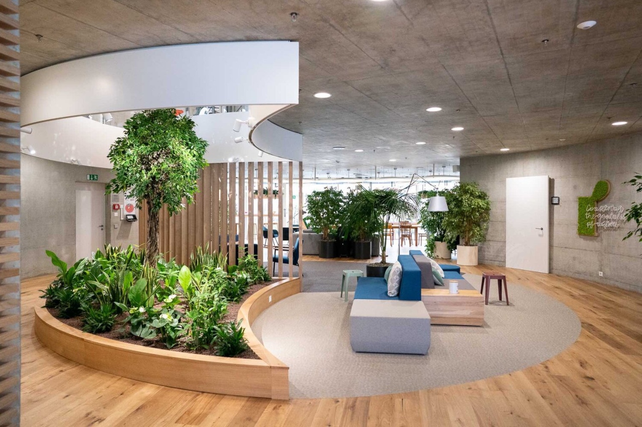
One of the worst design errors that can be made is to blindly follow a trend. Every organization has unique features that must be respected. What works for one organization doesn’t necessarily work for another. While the open style layouts employed by tech companies are popular right now, they may not always be the best approach.
For example, tech companies need areas for internal collaboration and innovation. It’s one of the reasons many of them feature large informal and casual areas for interaction. On the other hand, consider a consulting firm’s requirements. A consulting firm needs private spaces for collaborating and working with clients. Each space (tech vs consulting) has unique functions that require different designs.
2. Using One Approach for everyone

Don’t try to use a one-size-fits-all approach for an entire office. History shows this isn’t the best way forward. Cubicles were supposed to be the solution to office productivity. Then they were abandoned for open offices. Now open offices are falling to the wayside for a more balanced approach.
Companies are realizing and celebrating the fact that not everyone works the same way. Organizations are shifting away from sweeping changes. Furniture manufacturers are making solutions available as well. For example, Steelcase designed a collection with Susan Cain to provide balance from fully open environments. Diversity is needed in the workplace and it isn’t reasonable to expect everyone to feel comfortable in the same settings. Good design should account for these differences.
3. Thinking “If you build it, they will come”

Building out a number of collaborative and informal work huddle areas doesn’t mean that employees will actually use them. Organization culture will dictate whether employees will actually feel comfortable using these spaces. Creating spaces in line with a brand and culture provide a greater chance that a space will be used as designed.
When it is necessary to make changes to support a culture shift, consult with employees to see what is important and what they want. Then look to incorporate the feedback in the workplace design. If you’re interested in learning more about managing change in the workplace, you can get expert insight’s from our interview with HOK’s Robyn Baxter.
4. Failing to Future Proof

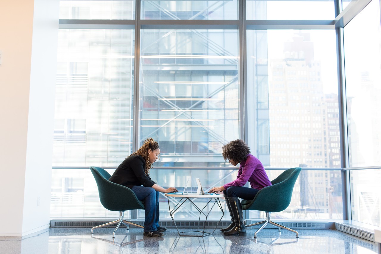
You won’t find an employee without their smartphone, laptop or tablet within the office today. This technology has made employees more mobile than ever. Failing to account for the growing use of technology in an office is a mistake.
Technology means that employees can work from anywhere. Knoll notes that:
On a typical day, desks are in use only 47% of the time while meeting room utilization tracks between 50-60%
It’s important to consider how technology will be used in meeting spaces. This means equipping them first and foremost with infrastructure to support smartphone productivity. Wireless charging is a must. Wireless charging infrastructure becomes even more important as phones are increasingly removing the number of ports available.
Future proofing also means considering the ergonomic impacts of the use of technology in spaces. If people are looking to be productive on a laptop, phone or tablet in multiple areas – design considerations should ensure the right ergonomic considerations have been taken. For example, height adjustable and desks shouldn’t be limited to personal workstations
5. Limiting Flexibility
Rigid spaces limit a user’s ability to make the adjustments they require. Flexibility on the other hand allows a company to adapt their physical layout to the way that work needs to be performed. As workers become increasingly mobile and want more choice in their workspaces, design must adapt as well.
Modular designs provide a simple solution. They allow office spaces to adapt as organizations change. For example, Teknion’s Zones collection was awarded with Best of NeoCon 2016 for the flexibility it provides. These adaptable work systems can easily be reconfigured based on specific tasks. Other design elements that employ flexibility include modular walls or even smart glass that serves multiple purposes.


