More companies are looking to capture their brand in the spaces they occupy. These 5 brands are setting an example of how it should be done:
1. VICE, Toronto

(Image: DesignAgency)
Year Completed: 2016
Square Footage: 24,500
Design Firm: DesignAgency
From scrappy beginnings in Montreal, Canada, VICE has become a media powerhouse with content coveted by today’s youth. Their new Toronto space is a departure from the startup feel that many remodeled HQs are adopting. VICE has always been a little different, and they emphasize that in their new HQ – many pieces of furniture in the space is custom made.
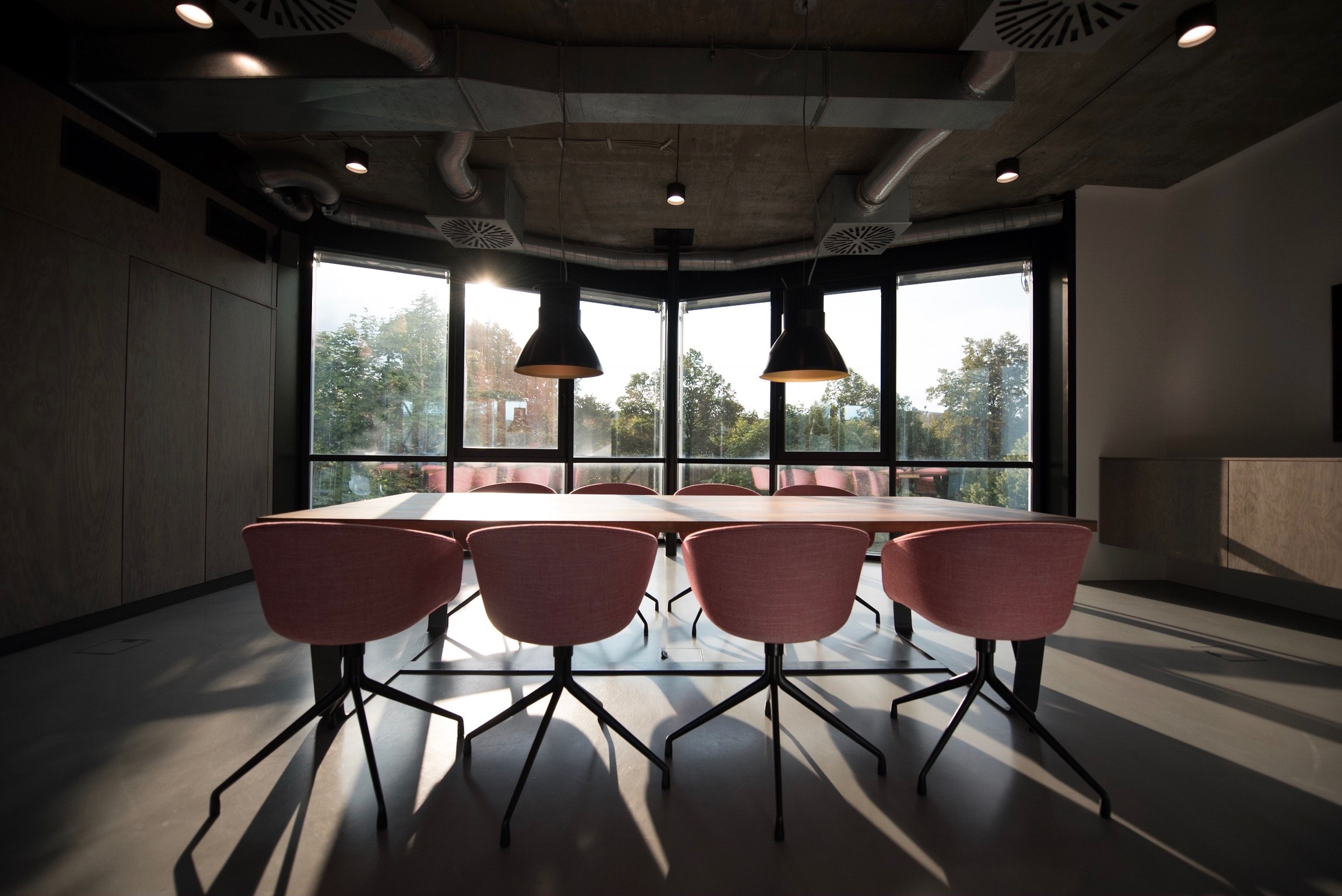
VICE opted for a timeless and classic look in their new Toronto space. The office channels an eclectic and irreverent feel that echoes the brand and breaks tradition and rules. Executives are seated at the same long tables as their staff, giving everyone the ability to get an on the ground feel.
Despite the classic and timeless look, technology was definitely well considered and integrated into the space. The whole office and lighting are primed to provide film ready shots for any shooting that needs to be done in the space.
2. Lego, Billund (Denmark)

(Image: C.F. Møller)
Year Completed: 2020 (expected)
Square Footage: 560,000
Design Firm: C. F. Møller (Architect)
Lego is dedicated to inspiring and developing the builders of tomorrow. They stay true to this brand promise by continuing to inspire the builders of today with their new Denmark office. Themes like real moveable and configurable workstations stay true to brand aspects such as their Play Promise – to take pride in creation and respect the joy of building. Additionally, the space hits on their 6 brand values – Imagination, creativity, fun, learning, caring and quality.
Their new HQ, at just over half a million square feet will be a nod to the iconic Lego block which inspired much of the design. Within the space, a sense of play will be encouraged with open areas and sofas that encourage group work. Additionally, features like an indoor garden are set to inspire imagination and creativity. Sticking to their brand values, the whole centre has a sense of playfulness and fun, complete with a mini golf course on the roof.
3. Telus, Toronto

(Image: Toronto Life)
Year Completed: 2010
Square Footage: 460,000
Design Firm: Kasian
One of Canada’s largest phone service providers, Telus has built a unique position as a leading customer friendly brand. This service excellence starts with their internal team and Telus has fostered a strong sense of commitment to their staff at their Toronto headquarters.
Employees are provided with choice and customization – from choosing their own department layouts to choosing which amenities they want to take advantage of. And there are a lot. At Telus House, Ontario HQ, Telus has dedicated 3 floors dedicated to wellness, entertainment and innovation.
4. Gensler, Denver

(Image: Gensler)
Year Completed: 2015
Square Footage: 23,000
Design Firm: Gensler
Gensler, the world’s leading collaborative design firm looks to deliver transformative workplaces for their customers.
When it comes to their brand, collaboration is at the core for Gensler. They highlight a global presence with a “one-firm ethos” that allows for knowledge to flow freely throughout the organization. In order to harness this knowledge, the design of their offices must allow for maximum collaboration. This collaborative design is on display at their new Denver location.
Using their own workplace research, the Denver office was designed with features like stadium seating, a café, and flexible workstations to allow for both large collaborative and individual work. The space also features a “Design Lounge” which connects the lobby with the workspaces to act as another zone for collaboration and knowledge flow.
5. Nixon Peabody, Washington, D.C.

(Image: Perkins + Will)
Year Completed: 2015
Square Footage: 65,656
Design Firm: Perkins+Will
Law offices have always been a bastion of tradition, but even designs there are changing. Nixon Peabody is looking to lead the way with a novel office design to accompany a new, forward looking brand – focused on innovative ideas and collective intelligence of the whole firm.
The space reflects enhanced teamwork and collaboration and the office design was based on feedback from employees. This true inclusiveness is a testament to the importance of leveraging the collective smarts of the firm.
Additionally, Nixon Peabody illustrated the importance of the team with the elimination of partner corner offices in favour of collaborative spaces for all. An interconnecting staircase spanning 3 floors promotes wellness and is connected to central kitchen areas to promote activity and casual collisions. The natural light and living wall provided throughout the feature staircase also promote the firm’s commitment to sustainability.


